————————————————————————————
Project Overview:
Theme: The scale of time increments
There are approximately 365.242199 days in a year. But that number is changing…constantly. Atomic clocks count 9,192,631,770 cycles per second of the cesium-133 atoms to maintain a precise second. Time operates differently depending on the scale of the time increment. Our perception of time is often bound by measurements of time that we cannot perceive. How can we reinterpret these out-of-scale increments into increments we can understand?
Assignment:
Build a relational clock that corresponds to a time scale that is not normally perceivable to humans. How can we visualize an imperceivable increment in relation to a perceivable increment?
Our group was comprised of: Alex Vessels, Patricia Adler, and Digital Noah.
————————————————————————————
Initial Ideas:
We began exploring ideas visualizing destruction in the world. One developed concept was to print lots of iconic symbols of natural resources on a long roll of paper, and then pass the paper through a hand-cranked shredder. As we thought together about developing this idea, it occurred to us to make the speed of the shredder accelerate to represent the acceleration of resource depletion.
As we focused more and more on the concept of time acceleration, the direction of our project changed all together.

————————————————————————————
Selected Concept: Acceleration of Time
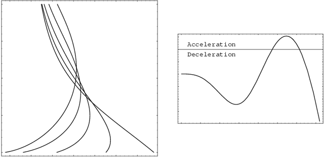
The very notion of time being flexible is quite amazing. We treat time as a constant, when in reality it is quite abstract and mutable. This is particularly clear when you focus on the in-between times, rather than on the time increments themselves: What if you measured time by the intervals in between significant events? Depending on your scope, time could be perceived as accelerating, decelerating or stable. If you consider the creation of matter and the universe, then time is decelerating as many initial significant changes took place quite rapidly and now matter shifts slowly over billions of years. Meanwhile, if you look at the evolution of intelligence, time is is accelerating, as fewer and fewer years separate the changes of highly intelligent life forms.
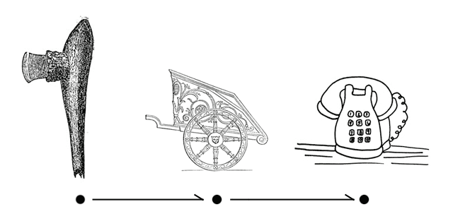
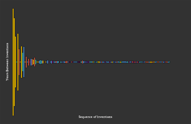
For the scope of our project, we focused directly on the intervals of time between significant inventions in human society.
————————————————————————————
Kurzweil’s Work:
The concept of time acceleration and deceleration has been explored in great detail by many scientist and thinkers, one of whom is Ray Kurzweil. In his book, The Age of Spiritual Machines, he writes extensively about the history of the universe and shows how it is both accelerating and decelerating. To read more of Kurzweil’s writing, follow this link.
————————————————————————————
Wikipedia Content:
Looking for data to read through and analyze, we stumbled on this wikipedia page. We scrubbed through the data, extracted much of it into a spreadsheet, and then wrote a Processing sketch to visualize this data.
————————————————————————————
Our Visualization:

Click here for the Interactive Processing Sketch.
