Visual ConCensus – US Census DataViz (12/20/2010)
screen99

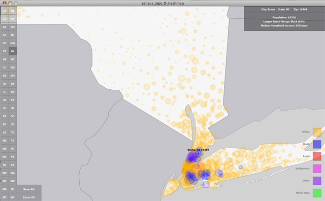
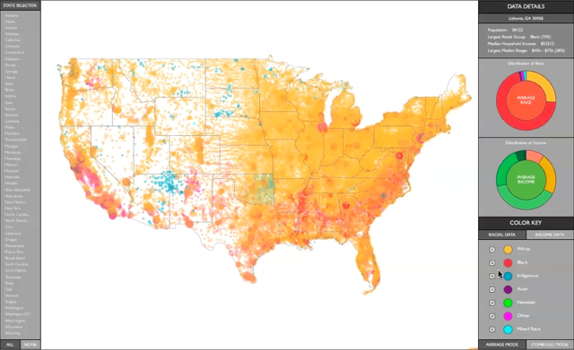
A final version of my US Census data visualization project is finished and has been on display at NYU’s ITP Winter Show.  The project visualizes racial and income data across the United States by coloring individual zip codes and plotting them on a map.  A configurable user interface allows users to toggle on and off a series of filters, focusing on individual states or particular demographics.  Within the data lie a multitude of stories, all of which are there for the user to discover and be provoked by.

Link to watch a video demonstration of the application.

Link to download the application (supports Mac OSX 10.5 or higher).
Visual ConCensus – User Interface Design (12/06/2010)

UI_study_small

InfoViz Midterm (11/01/2010)

I have continued working on the US Census Data visualization project for my midterm.

screen

Link to Video Demonstration

Link to Complete Processing Sketch

DataViz – US Census Data (10/18/2010)
NY State Census Data

NY State Census Data

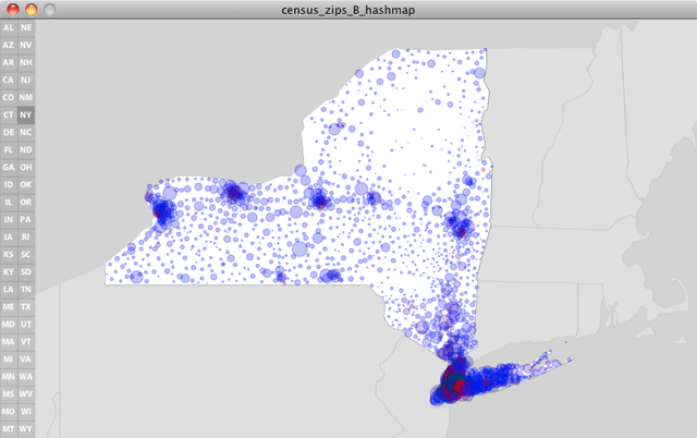
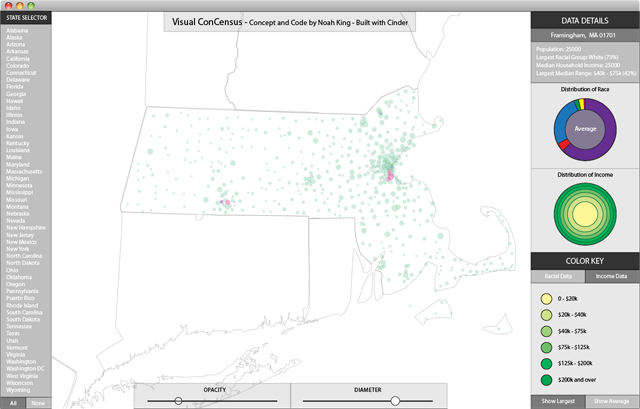
This week I tackled a much larger, and much more complex data set: the US Census data on population size, ethnicity, and family income. Much of my time has been in strategizing a data structure and getting my data into these hashmaps, arraylists, and objects. Next I worked on setting up vector maps of each state for the backdrop of the data, as well as programming a user-interface that allows users to pan and zoom the map, while also isolating data for each state.

The sketch in its current form is still very much a work in progress. My next steps are to store position and zoom details for each state to allow users to focus on individual locations, as well as to devise a way to visualize a region’s distribution of wealth as a series of concentric circles. Additionally, I’d like their to be pop-up windows that float in to give text-based info on whatever point your mouse is over. Likely this will turn into a midterm project, as tens of hours will be needed to resolve all this coding.

Link to the LIVE PROCESSING SKETCH. (note, the total filesize is 6.6MB, so please be patient as the sketch folder downloads).

Data Parsing with Processing – Part 2 (10/03/2010)


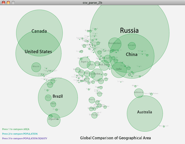
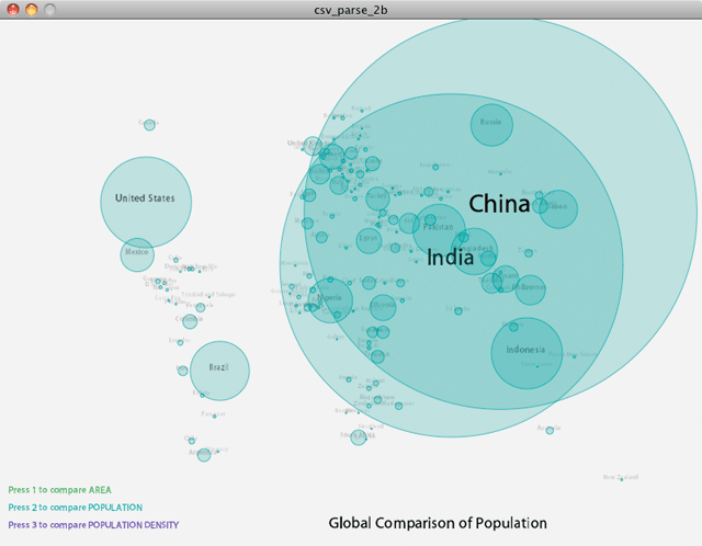
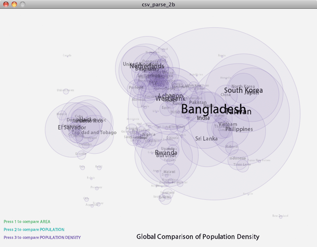
Using the CIA’s World Fact Book as a data source, I’ve created a comparative visualization of global population density.  Using the keyboard’s number keys, a user can toggle between seeing a global comparison of area, population, or population density.

World Fact Book data was provided to me as a SQL database, which I exported to CSV and groomed for visualization.  First I filtered out all countries with less than 1M residents, and next I filtered out anomolies such as Gaza and Hong Kong, as they are technically single city nations that have unusually high density and were subsequently skewing my graphics.

Processing was employed to parse the data, load it into objects, and display the objects as colored circles on-screen.  My next step will be to incorporate life expectancy and other quality-of-life factors to see if there is a correlation with population density.

Link to Source Code.  Link to LIVE PROCESSING SKETCH.

Data Parsing with Processing – Part 1 (9/27/2010)

dViz_screen

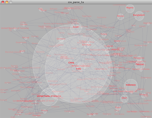
For the week 2 assignment in Expression Frameworks, I’ve taken the population of all the world’s countries and plugged it into a Processing sketch.

First, the comma-seperated-value data file was split into lines; next, the individual values for country name and population amount were extracted; and finally these values were stored into Objects for display and manipulation.

My Processing coding is a little rusty, so I thought I’d visualize each country as a bouncing ball, where the diameter was related to the population size.  In a loosely haphazard way, the balls bounce to and fro and are interconnected with lines.  I’d love for the visual variables to directly correlate with the data variables and for there to be additional cross-referencing data values (like GDP, etc), so I’m looking forward to developing this further into a true data visualization.

For now, I’m feeling more comfortable with my Processing syntax and getting even more excited about this class.

Link to the Data Source.  Link to the Code.  Link to the Live Processing Sketch.

Info Visualization Concepts (9/20/2010)

3 Places to get pre-formatted data:

A. Carnegie Mellon University Phonetic Dictionary

B. Central Park Weather Data

C. Yahoo Finance stock market data

Ideas of how to gather data:

1. Scrape data from the ITP list-serve, using the google group API.  Store data as (id, date, from, conversation_members, subject, number_of_posts)

2. Scrape data from Dictionary.com to supplement the CMU phonetic dictionary to include parts of speech.

3. Scrape McMaster Carr for all parts that they have 3d files for.

4. Put an accelerometer in all 4 elevator bays in my apt building, recording usage patterns.  Store data as (id, date_time, z_accel, accel_length, floor)

5. Put a hallway webcam in the peephole of my door.  Any time the image is moving, record date-time.  Any time the image stops moving, record date-time.  Cross reference time stamps with video footage logs.

6. Install a motion sensor, seismic sensor, and microphone on a subway platform.  Record amount of traffic.  Compare scheduled train times with actual times.  Flag times when decibel level is enough to cause hearing loss.

7. Wikipedia.  Crawl all articles and follow all links.  Assign a weight to each page for accuracy, dependent on how many refs are external from wikipedia.  Record how many unique contributors there are.  Record frequency of edits.